Live Data Dashboard |
Live data dashboard
Vision Environment’s unique live data dashboards allow you and your team to keep track of water quality and other monitoring in real time throughout your project.
Our dashboards can be completely customised for each individual client’s and/or project’s needs. They can show a variety of data including turbidity, BPAR light levels, current profiling (ADCP) and various other water parameters, meteorological data and more.
We can also set up two different versions of your dashboard – one for internal project management and a second to display live monitoring data on your website for community engagement throughout the construction project.
View our online demo dashboard or keep reading to learn more. (Note our dashboard works best in Google Chrome.)
What’s unique about our software?
We use Transpara Visual KPI software for our dashboards. We’ve spent more than 10 years refining its functionality and developing custom features to facilitate diverse project requirements.
Our long-term clients, including Gladstone Ports Corporation, North Queensland Bulk Ports and Lyttleton Port Company, have all regularly used our dashboards to manage water quality monitoring for major maintenance and capital dredging campaigns, and port construction activities.
To give you an idea of what you will see, we’ve set up a demonstration site using simulated, looped data.
Our demo dashboard gives you an idea of what this technology can offer in terms of real-time compliance management of marine construction and dredging projects.
For this simulation, two types of compliance trigger values are applicable for the real-time data (being updated every 15 min), with three different traffic light levels:
- Turbidity – normal (green), elevated (yellow) or high (orange)
- Light reaching seagrass – normal (green) or reduced (orange) in addition to number of days exceeded (light count).
Please note that simulated data does not reflect the water quality of the displayed area, nor does it indicate that dredging is actually occurring in this area.
Using our dashboards
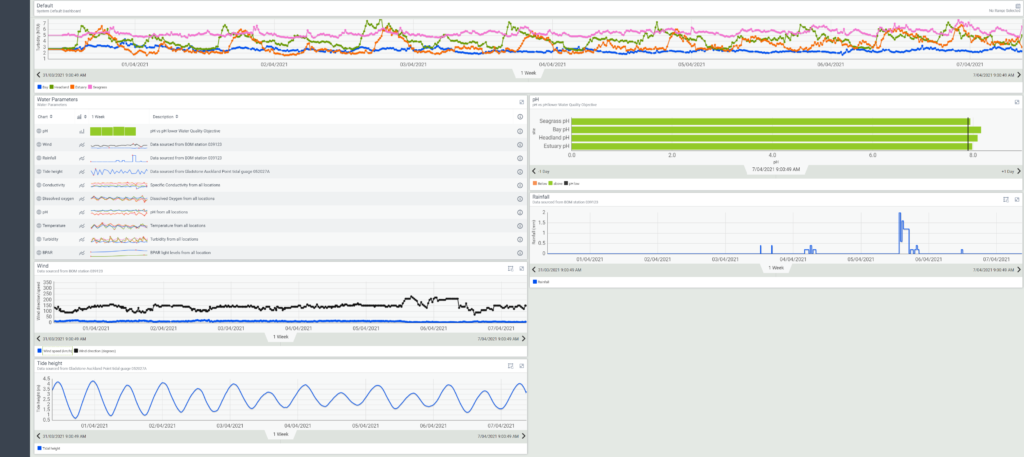
When you log into your secure live data site, you will see a main dashboard that allows you to observe all of your most important water quality data via engaging visual charts and graphs.
You can then access more detailed data via tabs on the left.
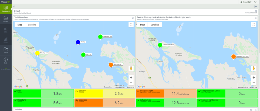
The screenshots below provide context for our short explanations.
View our live demo site to experience the dashboard for yourself.
Main dashboard
Maps
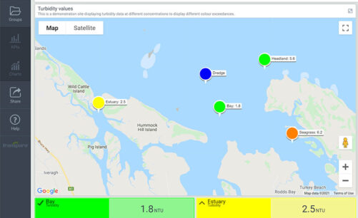
Two maps of the project area are displayed: one for turbidity and one for light. Each map shows the monitoring sites and the changing traffic light status and value for compliance at each of those sites.
The turbidity map additionally provides the live position of the dredge (blue). Site data and trigger value compliance is also summarised below the map in coloured blocks. Clicking on these or a site itself brings up detailed data for that site.
Turbidity Plot
The turbidity plot displays the last seven days data from all four turbidity sites to enable group trends to be identified.
Water Parameters
The multiparameter sondes measure physiochemistry other than turbidity, which are displayed in group plots. Clicking the plots provides more detailed information. The pH is additionally being compared in real time to the lower water quality objective.
Metocean Data
Meteorological data such us wind, rainfall and tides are being streamed live from the BOM and Queensland government sites (outsourced).
Tabs
Groups Tab
The groups tab summarises all individual KPIs colour triggers within their groups. For instance, seagrass light level and water turbidity.
KPI Tab
Individual site data is displayed in bullet bar graphs on the KPI tab. The current value appears in a solid black line and is compared to the three traffic light trigger levels. Click on any bullet bar graph to view the plot of data for that site against the trigger levels.
In cursor mode (icon in task bar), hover over the plot to display real data for that actual moment in time. Note the task bar icons at the top, which allow custom display of data (task bar explained further below).
Charts Tab
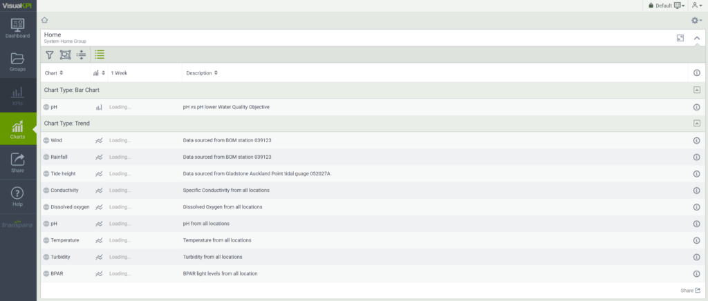
The charts tab displays trend plots for all parameters measured at water quality stations. Click on a plot to view more detailed data.
Share Tab
Send a link by email to the rest of your team about what you are seeing on the visual KPI dashboard using the share tab. (Note, this feature is disabled in our demo simulation.)
Task Bars (Detailed Data From Any Site Or Tab Plot)
Task bars appear at the top of every bar graph or plot and vary depending on the data.
For instance, click on the KPI tab and any site will bring up a detailed plot. The task bar allows you to custom display the data. For example:
- Trend options – adjustable multiple settings
- Time ranges – change the time range for the data you are viewing from the default seven days to up to all data from the start of the project, even if several years of data exists
- Revert – back to original plot
- Box zoom mode – zoom on a particular area of data such as a spike to identify exact time of occurrence
- Drag mode – drag the plot to a different time range rather than changing time range display
- Cursor mode – normal mode and for hover display
- Snap to – Allows identification of single readings. Clicking will save the readings permanently on the screen (until revert)
- Comments – Add a comment to the screen about what you are viewing which will be added to the screen in a comment bubble. This can then be shared with your team (disabled in this demo simulation).
View our demo dashboard
Now you’ve learned how our dashboard works, experience the demo dashboard for yourself. (Note our dashboard works best in Google Chrome.)

